
Now i'm continuing with the zine project that I talked about the other day. I explained what a zine was, when they were first invented, how they differentiate from magazines & showed an example of a popular zine in the media. And I called it simple before. Well it seemed simple then to be honest. But now i've got a lot more to look into, which I will be doing over several posts over the next number of days, and by doing this, I hope to cover most of the key areas in zine materials, techniques & processes. Today, I will be looking into other zines that have been made & targeting points about them, like why were they made? What/who was the intended audience/market? What is the plot/story in there, if there is any at all? Is it popular? Is there any consistency between issues of the zines and other zines? All these questions (and maybe a few more if you are lucky) will be answered over the next few days and week(s). And hopefully they will give me so guidance on how to create my own zine for the ongoing project. Well, best get on with it then.
 Ok so last week I started looking at the zine 'Maximum Rock N Roll' (or MRR), and I shall use this zine to help me structure my information on, not only this zine but others when I come to researching them too. 'Maximum Rock N Roll' is one of the most distributed and popular zines in the world, and it seems to really affiliate with the punk rock scene, the same kind of scene when the first zines were created & distributed, and I believe this where it originates from too. It is definately one of the most important presences in punk, as it has a wide-range of coverage in getting and showing stories, and it has also been a constant and ideologically influential presence in the ever-changing punk community. It is a monthly zine, so a new issue comes out every month, which is useful to know; so some zines are like magazines how they are distributed around the globe, though a zine's distributors are obviously a lot different to a magazine's. The zine has many critics on a number of issues. Editorial policy has sometimes been accused as narrow-minded or even elitist, causing some labels to boycott advertising in the zine or sending releases for review. The fact that punk is often considered as a movement opposed to authority and large institutions has also been an argument used to criticise the zine, which has sometimes been referred to as the 'Bible' of punk. MRR has always had a policy of not giving coverage to, nor accepting advertising from, bands that record on major labels; that policy was soon extended to bands that are "produced and distributed" by or otherwise a subsidiary of a major label.
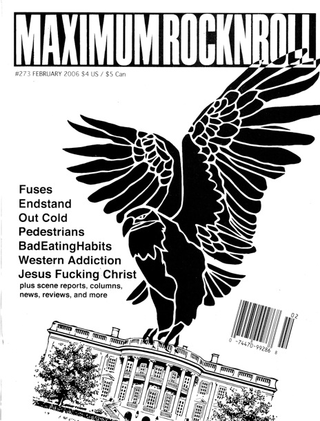
Here are various differing covers of MRR's zines, all based on the punk scene, primarily music by the looks of it, but, unlike a magazine, there is no consistency between these covers; on a magazine the heading, logo or name is nearly always in the same place and is nearly always the same text, font or typeface. That is the opposite here; we've got rather professional ones with good headings in a good location on the page (like the one on the bottom right of the page), and then there is one dead opposite it. Also on the one mentioned, the image is clearly the main attraction, and the image works well with the text in a clear form of hierarchy. In comparision, and opposition, the one in teh bottom left of the corner is completely different. For one, it looks like it's header has been cut up and stuck down then photocopied over. It takes up around half the page and cover, and is in conflict with the image below for supremacy on the cover. The text at the bottom looks almost hand written on the page (which may even be the case). You get the feeling that this was a quite effort by someone to create a cover, so they slapped a photo down and stuck down other bits on top of it.
Here is my ending conclusion on these two covers. Compared to 'Right' on the other corner, the 'Left' zine cover looks quick, tasteless and easily done, right? Well, I guess it does look like that, but in actually fact, it's the bottom left one that has the essence of a real zine. Though the one 'Right' one looks far more professional and better in terms of look, style, layout, composition, grids and every design term you can think of, it looks too much like a magazine to be a real zine. Everything is to well placed. The 'Left' one is far better in term sof design as it is more hand crafted and personalised, and is everything that you should associate with a true zine.
 |
| 'left' - good |
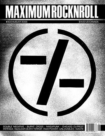 |
| 'right' - bad |
Based on my own personal research, knowledge and understanding of zines so far, that is the conclusion I have come to decide on. Bare in mind this is just my personal opinion of course, and someone else may think entirely different to me. But that is their opinion and this is my opinion. If anyone would like to comment or message about their ideas or views on zines then please feel free, and I'd love to discuss it with you.
This helps me, by showing that if a zine becomes too professional it loses all that makes it a so hand-crafted and unique. I think thsi will do for today blog wise, though this has actually helped me to build up an idea of how my front/pages/back need to be laid out.
No comments:
Post a Comment