Part of summer project (optional?) was to go and meet a designer or a design agency, ask them to comment and critique our portfolios, and ask them general questions about being a graphic designer.
Earlier on in the holiday, I arranged a meeting with an old friend of the family called Rob Jones, who owns a small, one-man firm in the town called Whittlesey called 'The Creative Workshop', which is a small drive away from my home town. I had a meeting with him, in which I took along my updated (with selected pieces of uni work) portfolio I used used a year ago to get into university with, along several of my preferred sketchbooks. He said that, though some bits could be changed, he liked the style of my work and my way of working, and he told me that the work I would be producing for a real-life client would be nothing like the work I have to do for a uni brief, namely the work is nowhere near as colourful, clear or easy..It's easier to complete and follow a brief than it is to follow a client's specific requests. We left the meeting with him saying that, if he could, he would give me some work to do over the holidays. Unfortunately, for whatever reason, he never managed to get back in touch with me. Despite this, I am grateful that I managed to meet him.
One of my nan's neighbour's son-in-law is a Graphic Designer in Peterborough. His name is Tim Lloyd, and he owns a company called 'Lloyd Design'. I had emailed him and asked if I could arrange a meeting with him, to which he agreed. He said that he may not be able to remain in the interview the whole time, due to other projects he was taking on, so it would have to be quick. In reality, the drive down there would of taken longer than the actual interview itself. Unfortunately, I was unable to meet him due to the fact that I could not get to the meeting. I apologised to him, and thanked him for his time.
Finally, I had a interview with a small design agency ion my hometown of March. The firm is called 'Finedesign'. I met the manager of the firm, called Mark Squires, and had a very friendly chat and interview with him. Again, same as Rob's interview, I took my portfolio and a variety of sketchbooks. He liked my work, though he said some of it was quite dark, and he told me that what they do is more bright pieces, in which they use their own photography whilst getting stuck not only into the design but alos the products they are designing for. The also offered me some work experience, but due to other reasons, they were unable to get back into contact with me and offer me further knowledge and insight into being a professional designer.
On the whole, the summer was quite disappointing. I was hoping for some work experience and atleast getting into a real world design brief. Biut unfortunately that's the way it goes sometimes. And it won't stop me now. It's been good getting advise and seeing what could be done differently. You can only go from strength to strength in design, and I own't allow anything to get me down for too long. Bring on tomorrow because it will always have something new to offer.

Monday, 26 September 2011
Thursday, 18 August 2011
Minimal Movie Posters : The Hangover
These are minimal movie posters based on characters in the film 'The Hangover'. I have added traits & characteristics to each character, and also details (such as scratches and cuts), that each character has/gains in the film.
 |
| Alan has a massive beard, and also gains a black eye from being punched in the face by Mike Tyson. |
 |
| Phil wears his sunglasses most of the time, and besides not shaving and getting a cut on the lip, he also gets scratched on the neck by Mike Tyson's tiger in the car. |
 |
| Stu loses his front tooth at the beginning of the film, and it turns out this is due to a dare by Alan to see if he is a good enough dentist by pulling it out. |
Sunday, 14 August 2011

Minimal Movie Posters
Recently inspired by the discovery of minimal movie poster designs, I have become inspired to do my own poster designs based on my favourite films.

First of all, is Hitman. A good film, and an amazing game franchise, I tried to catch the personality and theme of the film, as well as highlight who the character (Agent 47) is. I used the game's official font for the film, as well as the director's name.

Second is one of my top 5 films ever, Batman: The Dark Knight. An amazing film by visionary Christopher Nolan, who has truly brought the Batman franchise to recent greatness, it features Batman's journey to stop the maniacal Joker. I loved the film, and tried to show both of these 2 character's personalities and iconic traits through the design, which I feel has succeeded.

Third is once again, one of my top 5 films ever, and this one is Iron Man, directed by Jon Favreau. This film is so cool, and really that's the best way to describe it. Robert Downey Jr plays Iron Man/Tony Stark, and he creates the heroic character to protect the world. I loved the film, and tried to recreate the face as a minimal piece, but I feel that detail is necessary in showing how epic the character is.
More to come!
Hey, Long Time No Blog!
Hello, it's been a while since I last blogged (since February to be honest actually, so yeah a while)! Been up to so much, finished my first year of uni with good marks and I'm looking forward to getting back and seeing all my mates and again and moving into my new accommodation and meeting my new flatmates (2 I already know and 3 more yet to meet) too, so there is quite a bit to look forward to. Whilst I've been off I have had interviews with 2 design agencies, one in Whittlesey, and one in March, both are small towns not far from where I live. I have been offered work experience in September by one of the agencies, so hopefully this will become something influential in my future studies!
I have also done some drawing and doodles throughout my time off getting handy with programmes and trying to teach myself with tutorials over the internet. I even started to create my own website homepage, however, I felt I hadn't quite thought the layout through enough and I wasn't pleased with some of the parts I was hoping to incorporate into the design, so I have abandoned that for now, I may ask some friends from uni for some help and advise, 2 of which are highly proficient in the use of Dreamweaver.
I had also set myself a target of researching a number of designs/photographers/artists that I feel inspired by, and collect pieces of work for both inspiration and documentation. I have practised photography too, and trying to hone my skills even more so with a camera.
Best of all though. I have a girlfriend now and wow did I get lucky with this girl! Her name is Alice, and she is incredible, and I try not to let her forget that haha. She is both beautiful & smart, fun & happy and full of life, kind and supportive, I could really be here all day just listing all the amazing things shes done and helped me with, and all the inspiration she has given me, and really, how happy she makes me!
I'm so happy with everything in my life at the moment!
Truth is, though I'm glad first year is over and I'm ready to get back and see everyone, I am quite scared about the coming year! 1st years and 3rd years were out quite a bit last year, but 2nd years ahrdly did anything apart from work, and the reality has hit me that there is going to be a hell of a lot more hard work this year! This is where everything that I have collected through a collective of studies over multiple years really comes into play. It's all blood, sweat and tears from this point onwards. But the higher the stakes makes greater rewards. I work hard anyway, but this year I am determined to become the best I can be at this and nothing is going to stop my achieving my goal of becoming a great skilled and broad minded designer! It's on now!
I will be updating again soon, I had forgotten how much of a great way this is to document yourself and all the stuff I am have done/will do.
This is Joshua Hall, The Hall Of Design, signing off for now! (ps. my sister has managed to get into a media course at a prestigious college, so hopefully she'll become the Hall Of Media alongside me in design. Just a thought, but I like it!)
Also, I have finally designed a potential logo to represent myself. I have been struggling with this all summer, using design after design, but I finally settled upon this and I really like it, and I like what it can potentially represent about myself and the work I do.
 |
| 'WHEN NOTHING IS CERTAIN, ANYTHING IS POSSIBLE" |
Saturday, 26 February 2011
My FUNDAMENTAL Success!
I'm happy to say that my February submission for the FUNDAMENTAL SCY competition (see earlier post about the brief) has been selected as one of the winners, and will be used as posters and flyers, all over Lincoln, to promote the nightclub's friday event throughout March. This means I get VIP entry to the club through March, and only £1 drinks for the whole month! Really happy with this success! Not only can I use this in my portfolio for the future, but it's going to be amazing walking through town seeing my posters all over the place! Cannot wait!

Be prepared to see this design throughout Lincoln!

Be prepared to see this design throughout Lincoln!
Monday, 21 February 2011
Zines : A Graphic Exposition : Part IV
The final hurdle of the Zine project is to create a master copy of my final Zine, then photocopy it 5x in black & white. This will give me a grand total of 6 created Zines, 5 of which need to be given in for the deadline, along with my research and mock up/drafts and information I've gathered over the months...which includes the stuff I've done on this blog. I need to print all 16 pages back to front over 4 A4 pages (A5 pages 16 - 1 on one side and 2 - 15 on the other), whcih I've done for my master copy, and then, once all that is done, make any necessary personal changes to the master copy (I'm going to write on my master copy and put in information gathered at christmas as well as personal quotes and sketches and other opinions that I feel need to go in). Once that is done, I will photocopy all the pages (in black & white, as this is how tradition Zines are made and it also saves us a lot of money as black & white is cheaper than coloured inks) and put them together to create my other zines. After that I'll need to bind them all, and then that should be it.
My Zine is called 'THE COLDHAM COMPASS'. This is because my Zine is based around my local community, my home village, Coldham. When I lived in Coldham, I didn't know everything about it, didn't know a lot of it's history, and I've never fully realised what was good & bad about it. This community project has helped me realise and understand my village, and I have learnt more about it over the last number of weeks than I have done over the last 12 years of living there. The reason it is called "THE COLDHAM COMPASS' is because it is meant to represent the fact that Coldham is had so many ideas and directions placed into it and, for the most part, nothing has ever fully happened there before. Also, because there is actually more to Coldham than meets the eye. Someone who doesn't live there will think it's just a small hamlet in the middle of nowhere, but for those who live there, there are many things that the community have to deal with, not only on their own but together as well. This is the kind of style I'm trying to show and capture in my Zines. Hopefully I will.
 |
| My Zine is called 'THE COLDHAM COMPASS'. This is my front cover (page 1 - left) & back cover (page 16 - right). |
My Zine is called 'THE COLDHAM COMPASS'. This is because my Zine is based around my local community, my home village, Coldham. When I lived in Coldham, I didn't know everything about it, didn't know a lot of it's history, and I've never fully realised what was good & bad about it. This community project has helped me realise and understand my village, and I have learnt more about it over the last number of weeks than I have done over the last 12 years of living there. The reason it is called "THE COLDHAM COMPASS' is because it is meant to represent the fact that Coldham is had so many ideas and directions placed into it and, for the most part, nothing has ever fully happened there before. Also, because there is actually more to Coldham than meets the eye. Someone who doesn't live there will think it's just a small hamlet in the middle of nowhere, but for those who live there, there are many things that the community have to deal with, not only on their own but together as well. This is the kind of style I'm trying to show and capture in my Zines. Hopefully I will.
Tuesday, 15 February 2011
In Every Frame & Vernacular
Over the last 2 weeks we have had two more photography challenges.
The first one of these briefs we were given was called 'In Every Frame'. We had to create 10 photographs based on the theme of surveillance and show consideration of sequence and art direction as a way of conveying narrative, character and atmosphere. So we had to create an initial storyboard, showing what and how our story is going to be based on and where it is going. We also had to choose a subject to photograph, and give them our instructions on how to pull off a pose or cast a shadow etc where we wanted it. I choose my good friend Harry Winfield as my subject. Whilst always showing basic rules and principles of photography well and accurately, we had to make these as dark and stalker themed as possible.


 |
| Real weird ending eyyy? I dunno I just had this idea in my head of it should end, and it did...with no inspiration from Iron Man or E.T....none in the slightest. |
The second, most recent, and final photography-brief, was 'Vernacular'. We had to create 10 photographs in a form of social documentation, with observational skills and confident photography execution. Now, for those of you who have no idea what the word 'Vernacular' means, which I didn't until before I went out to take my pictures, it is meant to create a descriptive for something unique or peculiar to a certain place. Like a tractor on a farm, or a log cabin in a wood (example given to me by Harry). In a way, it is being able to identify a location through imagery instead of/as opposed to words. I shot all my images around Lincoln, and gathered a broad range of imagery to complete this brief. Whilst always showing basic rules and principles of photography well and accurately, I really had to look at the foundations of Lincoln and why they were it's foundations, choose my shots wisely and really be able to identify them with Lincoln before I could use them.


Thursday, 10 February 2011
FUNDAMENTAL
In December a local club in lincoln called SCY sent out a new brief to the Graphic Design students at Lincoln Uni, to create a flyer/poster for their new event on friday nights called FUNDAMENTAL. It is a monthly competition for us design students. Once designed, we have to send our flyers to SCY and then they will choose who comes in first, second and third place. The best 3 will go in the club and throughout Lincoln. The briefs are based on quotes which we have to place in the design, and we have to include the FUNDAMENTAL logo and symbol, as well as SCY's logo. Also, on the back side, we have to place the information like when it is open, times, prices and drinks etc.
I have created & submitted designs for the competition in both January & February, and I must tell ya.....my February one is sooooooo much better than my January one.
 |
| FUNDAMENTAL January submission. |
Well February has arrived, and so has SCY's February FUNDAMENTAL brief. And, here is what I managed to create for it.
 |
| FUNDAMENTAL February submission. |
Sunday, 6 February 2011
Zines : A Graphic Exposition : Part III
 For the next part of the Zine work i've got to do, i've now got to do some drafts and 3x Zine proposals for next the next lesson. I've got to decide how many pages my zine is going to be composed of, and what articles/stories are going to be where in my finished Zine. 3 different drafts for a Zine isn't as easy as it sounds though! If my Zine has 16 pages then that means I will need to do design proposals for 3 lots of 16 pages, a total of 48 pages. Now, i'm not sure how to make all my Zines different from each other, but I guess this is the part where we try and get a real look and feel for our Zines, and try to give the right understanding and direction for each of them. I guess the more drafts there are, the easier it will be to create a ultimate final design.
 Websites I'm going to try and use to help design my Zines are:
http://www.undergroundpress.org/pdf/Zines101.pdf - Zines 101 – A Quick Guide to Zines : Extremely handy little website with general and advanced information on Zines.
http://aisling.net/zine-layouts/ - A page taken from http://aisling.net/ : This is a page from the website of Aisling D’Art, a third-generation artist.
http://en.wikibooks.org/wiki/Zine_making - Everything you need to know about Zine construction.
http://en.wikibooks.org/wiki/Zine_Making/Putting_pages_together - : A guide to constructing a Zine using the correct number of pages. very handy, especially if you're not sure what paper to use and how much of it is needed.
 |
| This is the general set up for a 16 page Zine. This is how many pages i'm using for mine, so this is how I will be laying mine out when I come to make it. |
http://designinstruct.com/print-design/design-a-handmade-art-zine/ - A step by step guide on making a special Zine : by David Pena, a freelance designer / illustrator. This looks absolutely awesome, wish (or hope) my Zine looks something like this.
http://www.toasted-cheese.com/ab/05-05.htm - A guide to zines, with good knowledge and information : by Stephanie Lenz.

These pages should help in the construction of my Zine. Hopefully they will also be insightful for others who may need some help with their Zines. Most of this is based on personal experiences of other makers, and everyone has many, many failures. The trick with it is too never get discouraged. You can only learn by doing, and you learn the most from your mistakes.
Thursday, 3 February 2011
Beauty
Alongside our Zines brief, we have also been set weekly photography briefs and challenges. Each week, our tutor gives us a lecture on the rules and compositions and styles of photography, which are extremely interesting as they show photographers and examples of their work, and then we are set the task of going out into the world and photographing the subject we given to look at.
Certain principles of photography that we have been taught and need to learn for ourselves include the 'Rule of Thirds', 'Leading Lines', 'Shot Construction', 'Wide Shots & Close Ups', 'Lighting', 'Backgrounds' and 'Exposure'; all things that we need to use/take advantage of in our photography and image making.
The first one of these briefs we were given was Beauty. As the old saying goes 'beauty is in the eye of the beholder', and this is most certainly true, as it is up to us what we photograph and up to us how we create the image and give off a message in our images, as long as it can in some way covey beauty, or follows the basic rules and princoples of photography well and accurately.
Here are my 10 images:
 |
| Beauty in...Architecture |
 |
| Beauty in...Nature |
 |
| Beauty in...Stone |
 |
| Beauty in...Steel |
 |
| Beauty in...Abstract |
 |
| Beauty in...Wood |
 |
| Beauty in...Structure |
 |
| Beauty in...Human Features |
 |
| Beauty in...Straight Lines |
 |
| Beauty in...Leading Lines |
Monday, 31 January 2011
Zines : A Graphic Exposition : Part II
Now i'm continuing with the zine project that I talked about the other day. I explained what a zine was, when they were first invented, how they differentiate from magazines & showed an example of a popular zine in the media. And I called it simple before. Well it seemed simple then to be honest. But now i've got a lot more to look into, which I will be doing over several posts over the next number of days, and by doing this, I hope to cover most of the key areas in zine materials, techniques & processes. Today, I will be looking into other zines that have been made & targeting points about them, like why were they made? What/who was the intended audience/market? What is the plot/story in there, if there is any at all? Is it popular? Is there any consistency between issues of the zines and other zines? All these questions (and maybe a few more if you are lucky) will be answered over the next few days and week(s). And hopefully they will give me so guidance on how to create my own zine for the ongoing project. Well, best get on with it then.
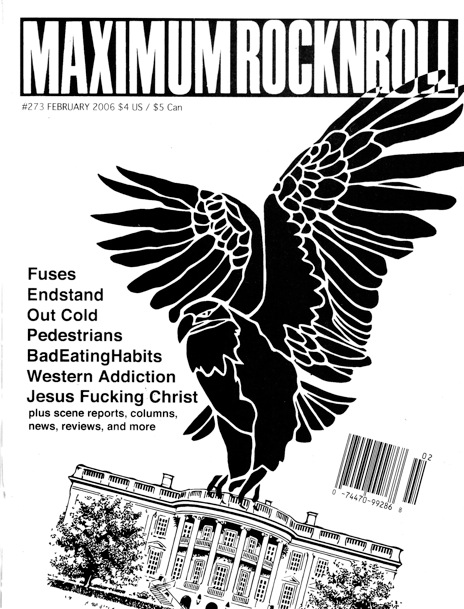
 Ok so last week I started looking at the zine 'Maximum Rock N Roll' (or MRR), and I shall use this zine to help me structure my information on, not only this zine but others when I come to researching them too. 'Maximum Rock N Roll' is one of the most distributed and popular zines in the world, and it seems to really affiliate with the punk rock scene, the same kind of scene when the first zines were created & distributed, and I believe this where it originates from too. It is definately one of the most important presences in punk, as it has a wide-range of coverage in getting and showing stories, and it has also been a constant and ideologically influential presence in the ever-changing punk community. It is a monthly zine, so a new issue comes out every month, which is useful to know; so some zines are like magazines how they are distributed around the globe, though a zine's distributors are obviously a lot different to a magazine's. The zine has many critics on a number of issues. Editorial policy has sometimes been accused as narrow-minded or even elitist, causing some labels to boycott advertising in the zine or sending releases for review. The fact that punk is often considered as a movement opposed to authority and large institutions has also been an argument used to criticise the zine, which has sometimes been referred to as the 'Bible' of punk. MRR has always had a policy of not giving coverage to, nor accepting advertising from, bands that record on major labels; that policy was soon extended to bands that are "produced and distributed" by or otherwise a subsidiary of a major label.
Here are various differing covers of MRR's zines, all based on the punk scene, primarily music by the looks of it, but, unlike a magazine, there is no consistency between these covers; on a magazine the heading, logo or name is nearly always in the same place and is nearly always the same text, font or typeface. That is the opposite here; we've got rather professional ones with good headings in a good location on the page (like the one on the bottom right of the page), and then there is one dead opposite it. Also on the one mentioned, the image is clearly the main attraction, and the image works well with the text in a clear form of hierarchy. In comparision, and opposition, the one in teh bottom left of the corner is completely different. For one, it looks like it's header has been cut up and stuck down then photocopied over. It takes up around half the page and cover, and is in conflict with the image below for supremacy on the cover. The text at the bottom looks almost hand written on the page (which may even be the case). You get the feeling that this was a quite effort by someone to create a cover, so they slapped a photo down and stuck down other bits on top of it.
Here is my ending conclusion on these two covers. Compared to 'Right' on the other corner, the 'Left' zine cover looks quick, tasteless and easily done, right? Well, I guess it does look like that, but in actually fact, it's the bottom left one that has the essence of a real zine. Though the one 'Right' one looks far more professional and better in terms of look, style, layout, composition, grids and every design term you can think of, it looks too much like a magazine to be a real zine. Everything is to well placed. The 'Left' one is far better in term sof design as it is more hand crafted and personalised, and is everything that you should associate with a true zine.
 |
| 'left' - good |
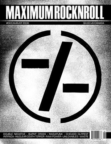 |
| 'right' - bad |
Based on my own personal research, knowledge and understanding of zines so far, that is the conclusion I have come to decide on. Bare in mind this is just my personal opinion of course, and someone else may think entirely different to me. But that is their opinion and this is my opinion. If anyone would like to comment or message about their ideas or views on zines then please feel free, and I'd love to discuss it with you.
This helps me, by showing that if a zine becomes too professional it loses all that makes it a so hand-crafted and unique. I think thsi will do for today blog wise, though this has actually helped me to build up an idea of how my front/pages/back need to be laid out.
Subscribe to:
Posts (Atom)